
Typography
The Typography panel sets the text sizes and text colors LearnDash uses sitewide. Sizes are grouped into five tiers, from section headings down to small labels. Colors start from one base text color, and more specific color settings override it where needed.
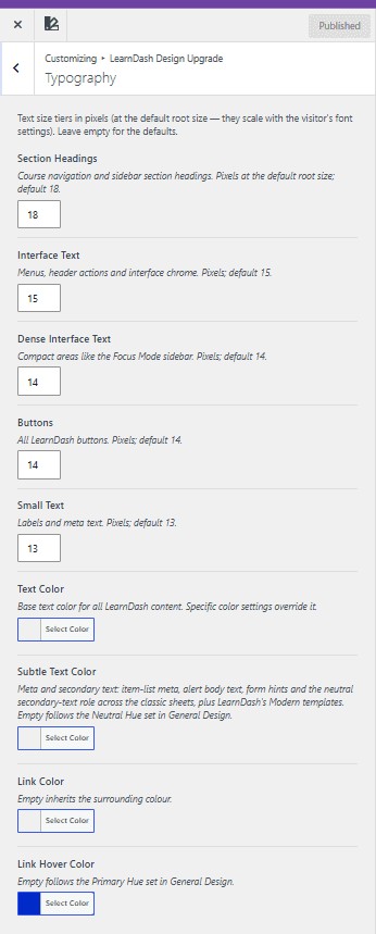
Text size tiers
Each tier sets a text size in pixels (px), measured at the default root size. Because they’re tied to the root size, these sizes scale with the visitor’s browser font settings. Leave a field empty to use its default.
Section headings
Section Headings sets the size of course navigation and sidebar section headings. The default is 18 px.
Interface text
Interface Text sets the size of menus, header actions, and interface chrome. The default is 15 px.
Dense interface text
Dense Interface Text sets the size of text in compact areas, such as the Focus Mode sidebar. The default is 14 px.
Buttons
Buttons sets the text size for all LearnDash buttons. The default is 14 px.
Small text
Small Text sets the size of labels and meta text. The default is 13 px.
Text colors
Text color
Text Color sets the base text color for all LearnDash content. Specific color settings, including the ones below and those on other panels, override it.
Subtle text color
Subtle Text Color sets the color of meta and secondary text, including:
- item-list meta
- alert body text
- form hints
- the neutral secondary-text role across the classic stylesheets
- LearnDash’s Modern templates
Leave it empty to follow the Neutral Hue set in General Design.
Link colors
Link color
Link Color sets the color of links in LearnDash content. Leave it empty to inherit the color of the surrounding text.
Link hover color
Link Hover Color sets the color of links on hover. Leave it empty to follow the Primary Hue set in General Design.