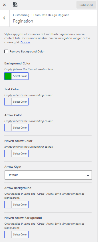
Pagination
NOTE
NOTE These pagination style options require a recent version of Design Upgrade Pro. If you don’t see them in the Customizer, update the plugin to the latest version.
These styles apply to every instance of LearnDash pagination:
- course content lists
- focus mode sidebar
- course navigation widget
- the course grid
Pagination controls only appear once a list has more items than the display limit you set in LearnDash. See Enabling pagination below to turn that on for each content type.
Note: These pagination style options require a recent version of Design Upgrade Pro. If you don’t see them in the Customizer, update the plugin to the latest version.
Enabling pagination
Pagination only appears once a list has more items than the limit you set in LearnDash. Turn it on for each content type below.

Course pagination
- Go to LearnDash LMS > Courses in your WordPress dashboard.
- Select the course you want to edit, or open your global course settings.
- Go to Settings > Display & Content Options.
- Set the pagination or items-per-page field to a number higher than 0, such as 10 or 20.
Lesson and topic pagination
- Go to LearnDash LMS > Lessons > Settings for global configuration.
- Find the Posts Per Page or pagination limit option.
- Enter your desired limit. Setting it to 0 disables pagination.
Using the visual Course Builder for a specific course can override these global post settings.
Course grid pagination
Add the num attribute to your course grid shortcode. For example, [ ld_course_list num="12"] shows 12 courses per page before pagination links appear.
Available Customization
Background
Remove background color
Remove Background Color removes the pagination background entirely. When it’s checked, the Background Color setting has no effect.
Background color
Background Color sets the pagination background color. Leave it empty to follow the Neutral Hue set in General Design.
Text
Text color
Text Color sets the color of the page numbers at the center of the pagination. For the course grid, the text reads Page 1 / 3. For every other instance, it reads 1 of 3. Leave it empty to inherit the surrounding color.
Arrows
The arrows sit to the left and right of the page numbers and move a user through the pages.
Arrow color
Arrow Color sets the color of all navigation arrows. Leave it empty to inherit the surrounding color.
Hover: Arrow color
Hover: Arrow Color sets the arrow color when a user’s mouse hovers over it. Leave it empty to inherit the surrounding color.
Arrow style
Arrow Style sets how the arrows look. Default shows the arrows as plain text or icons, matching LearnDash’s own style. Circle places a circle around each arrow, colored by the Arrow Background settings below.
Arrow background
Arrow Background sets the circle color in the arrow’s normal state. It only applies if Arrow Style is set to Circle. Leave it empty to render it transparent.
Hover: Arrow background
Hover: Arrow Background sets the circle color when a user hovers over the arrow. It only applies if Arrow Style is set to Circle. Leave it empty to render it transparent.
Other notes
- An arrow with no previous or next page to navigate to renders at 25% opacity, to show it isn’t clickable.
- The border radius of the pagination background (if not being hidden) uses the Button Border Radius setting from the Buttons panel.
- Course grid pagination uses different icons and a different style than other instances, but every option above still applies.