
Buttons
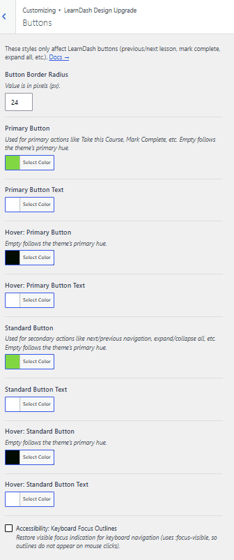
The Buttons panel controls every LearnDash button in one place, so you don’t have to restyle buttons on other panels. These styles only affect LearnDash buttons, such as previous/next lesson navigation, Mark Complete, and expand all. Buttons used by the third-party plugins Design Upgrade Pro supports follow these styles too.
Button border radius
Button Border Radius sets the corner rounding for LearnDash buttons. Enter the value in pixels (px).
Primary button
Primary buttons are used for primary actions such as Take this Course and Mark Complete.
Primary button
Primary Button sets the background color of primary buttons. Leave it empty to follow the Primary Hue set in General Design.
Primary button text
Primary Button Text sets the text color of primary buttons.
Hover: Primary button
Hover: Primary Button sets the background color of primary buttons on hover. Leave it empty to follow the Primary Hue set in General Design.
Hover: Primary button text
Hover: Primary Button Text sets the text color of primary buttons on hover.
Standard buttons
Standard buttons are used for secondary actions such as next/previous navigation and expand/collapse all.
Standard button
Standard Button sets the background color of standard buttons. Leave it empty to follow the Primary Hue set in General Design.
Standard button text
Standard Button Text sets the text color of standard buttons.
Hover: Standard button
Hover: Standard Button sets the background color of standard buttons on hover. Leave it empty to follow the Primary Hue set in General Design.
Hover: Standard button text
Hover: Standard Button Text sets the text color of standard buttons on hover.
Hover styles
The hover state triggers when a mouse hovers over a button, or when someone taps a button on a touch-enabled device.
Accessibility
Accessibility: Keyboard focus outlines
Keyboard Focus Outlines shows a visible focus indicator during keyboard navigation. It uses :focus-visible, so outlines don’t appear on mouse clicks. This setting is on by default. Turning it off leaves keyboard users without any focus indication.
Accessibility: Focus ring color
Focus Ring Color sets the outline drawn around buttons, links, and fields on keyboard focus. Pick a color that stands out from both the page background and your button colors. Leave it empty to follow the Primary Hue set in General Design.
Other notes
Buttons in the LearnDash login and registration modal don’t use these styles. Style those on the Login & Registration panel instead.
Button colors inside alert messages come from the Alerts panel.