
Alerts
Alerts are short messages LearnDash displays after an action is taken, or when further action is necessary. Examples include a warning that an assignment is awaiting approval, confirmation that an assignment was deleted, or a notice that a dripped lesson isn’t available yet. Color-coding each alert type helps students recognize its meaning at a glance.
Types of alerts
LearnDash uses three alert types, depending on the situation.
General alert
A general alert covers everything that isn’t a warning or a success, such as a notice on a dripped lesson before it’s available.

Warning
A warning signals an error, or something that needs your attention.

Success
A success alert confirms a successful action, such as completing the “download certificate” box.

Global options
These settings apply to every alert type. All alerts also inherit the Global Border Radius set in General Design.
Reduce alert size
Reduce Alert Size shrinks all alerts.
Remove alert icons
Remove Alert Icons removes the icons from all alerts, leaving only the alert text.
Border width
Border Width sets the alert border width. Enter the value in pixels (px). Leave it empty to use the global Bold Border Width set in General Design.
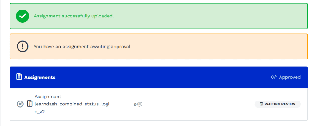
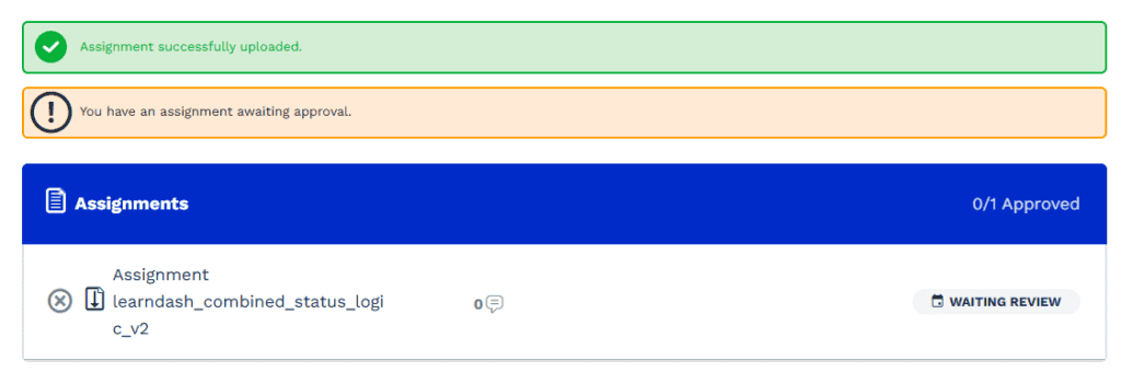
All alerts will inherit the Global Border Radius set on the General Design panel
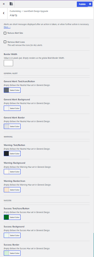
General alert colors
Each label tells you which parts of the alert share a color. Text/Icon/Button, for example, applies one color to the alert’s text, icon, and button together.
General Alert: Text/Icon/Button
General Alert: Text/Icon/Button sets the text, icon, and button color of general alerts. Leave it empty to follow the Neutral Hue set in General Design.
General Alert: Background
General Alert: Background sets the background color of general alerts. Leave it empty to follow the Neutral Hue set in General Design.
General Alert: Border
General Alert: Border sets the border color of general alerts. Leave it empty to follow the Neutral Hue set in General Design.
Warning colors
Warning: Text/Button
Warning: Text/Button sets the text and button color of warning alerts. Leave it empty to follow the Neutral Hue set in General Design.
Warning: Background
Warning: Background sets the background color of warning alerts. Leave it empty to follow the Warning Hue set in General Design.
Warning: Border/Icon
Warning: Border/Icon sets the border and icon color of warning alerts. Leave it empty to follow the Warning Hue set in General Design.
Success colors
Success: Text/Icon/Button
Success: Text/Icon/Button sets the text, icon, and button color of success alerts. Leave it empty to follow the Success Hue set in General Design.
Success: Background
Success: Background sets the background color of success alerts. Leave it empty to follow the Success Hue set in General Design.
Success: Border
Success: Border sets the border color of success alerts. Leave it empty to follow the Success Hue set in General Design.
All alerts will inherit the Global Border Radius set on the General Design panel
Testing alert designs
You can publish your alert changes right away, or test them first. Here’s the fastest way to trigger all three alert types:
- Go to LearnDash LMS > Settings.
- Create a closed course only you, as an admin, can access.
- Add two lessons to the course.
- For Lesson 1, enable Assignment Uploads, set grading to Manually Grade, and enable Allow File Deletion.
- For Lesson 2, set the Lesson Release Schedule to a future date.
- From the All Courses screen, click View on your test course.
- Click Customize in the admin bar to open the Customizer on the course page.
- When you upload an assignment to Lesson 1, you’ll see a warning alert that says, “You have an assignment awaiting approval.” You need to upload an assignment on the frontend of the site (not in the Customizer).
- When you delete that assignment, you’ll see a success alert that says, “Assignment successfully deleted.”
- When you try to view Lesson 2, you’ll see a general alert that contains the date the lesson will become available, along with a “Back to Course” button. To see the Lesson 2 page, click the calendar icon next to the lesson title in the sidebar navigation.