
Course Content Lists
These settings apply to “Course Content” at the bottom of course pages, as well as “Lesson Content”, quiz, and assignment lists. This panel has more style options than any other panel in Design Upgrade Pro, so it’s organized into groups below.
What are Course Content Lists?
Course content lists show up in two places on a LearnDash site.
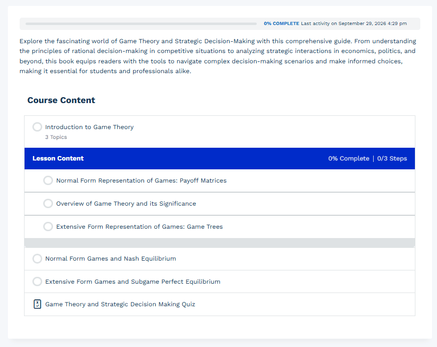
At the bottom of a course page, a header reads “Course Content,” followed by a list of the sections, lessons, topics, and quizzes that belong to that course. This is the main course content list.
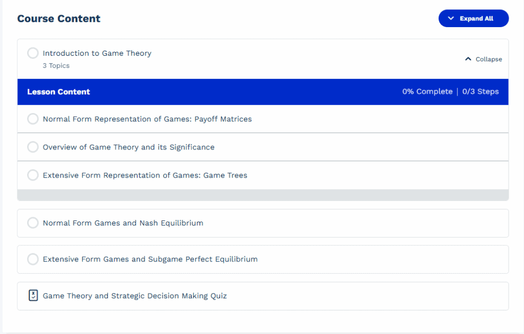
- If you use LearnDash topics, a “Lesson Content” area is automatically inserted at the bottom of each lesson. It lists the topics, and topic quizzes if applicable, that belong to that lesson. Course content list styles apply here too.
Options
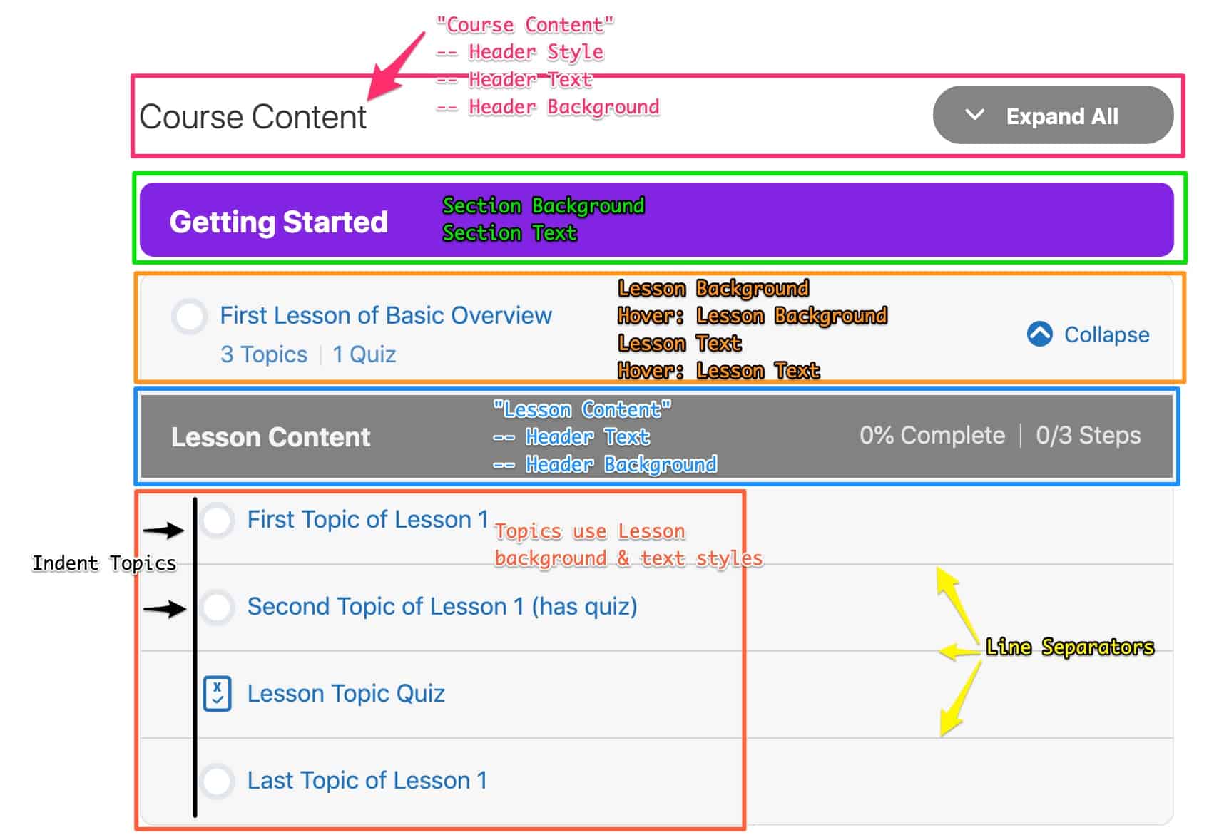
Each setting below controls one part of the course content list. The diagram on this page maps each setting to the area it affects.
Expand/collapse
Disable expand/collapse
Disable Expand/Collapse removes the Expand/Collapse links and always displays all content. Turning it on does the following:
- Always displays all topics and quizzes beneath the lessons that contain them
- Removes the individual “Expand” links next to each lesson that contains at least one topic or quiz
- Removes the “Expand All” button at the top
PAGINATION
We don’t take pagination into consideration. If you’re using LearnDash pagination, have your “items per page” setting at a certain number, and have more items than that in a particular course, pagination will still apply.
“Course Content” Styles
These settings style the words “Course Content” displayed at the top of the list.
“Course Content” header style
“Course Content” Header Style sets how the header displays. The default is Default.
Default shows “Course Content” as plain text. The text color applies, but the background color doesn’t.
Boxed adds a container around “Course Content” and the Expand All/Collapse All button. Choose a background and text color when using this style. Its corners use the Global Border Radius set in General Design.
Hidden hides the words “Course Content.” Background and text colors don’t apply.
“Course Content” header background
“Course Content” Header Background sets the background color of the header container when Header Style is set to Boxed. Leave it empty to render it transparent.
“Course Content” header text
“Course Content” Header Text sets the color of the “Course Content” text. Leave it empty to inherit the surrounding color.
- “Course Content” Header Style
- Default: This will display the words “Course Content” in simple text. With this option, the text color will apply, but the background color will not.
- Boxed: This will add a container around “Course Content” and the Expand All/Collapse All button. We highly recommend selecting background & text colors with this option. Your Global Border Radius will also be used for the corners.
- Hidden: This will hide the words “Course Content.” Background & text colors won’t apply here.
- “Course Content” Header Background: This will change the background color of the container, when using the “Boxed” option above
- “Course Content” Header Text: This will change the text color of “Course Content”
Container Styles
These 4 styles give you the option to add a container around all of your course content. If applied, the container will surround all sections, lessons, topics & quizzes. It excludes the top “Course Content” area.
- Container Style
- Default: This will display your lessons in the default format provided by LearnDash. The background, border width & border color don’t apply here.
- Boxed: This will add a container around all of your course content. You need to also pick at least a background color or a border in order to see the container. Your Global Border Radius will be used for the corners.
- Container Background: The color used for your container background, when “Boxed” is chosen above
- Container Border Width: The width (or size) of the border used for your container, when “Boxed” is chosen above
- Container Border: The color used for your container border, when “Boxed” is chosen above
Lesson Style
This option gives you two main choices for how to display your list of lessons.
- Default: This will display each lesson in its own container, with a small margin beneath each lesson. This is how LearnDash displays the course content by default. Your Global Border Radius will be used for the corners of each lesson.
- Table: This is a throwback to the old style that LearnDash used to use, before releasing version 3.0. All lessons will be connected, with a horizontal line separating them. This creates the appearance of a table.
Each section will still be displayed separately, with some space in-between each one. The Lesson Border color & Lesson Border Width options (see below in “Lesson Styles”) are used for the horizontal lines. No border radius is applied when using this option.
Lesson Styles
There are a few lesson styles you can apply to course content lists – background color, text color, border width & border color – some of which can also be changed on hover.
In addition to lessons within the course content lists, these styles also apply in the following places:
- topics within the course content list
- topic lists on a lesson page
- quiz lists on a lesson or topic page
- assignment lists
Here are the available settings:
- Lesson Background: The background color of the clickable area
- Hover: Lesson Background: The background color of the clickable area, when the mouse hovers over it
- Lesson Text: The text color of the item’s title
- Hover: Lesson Text: The text color of the item’s title, when the mouse hovers over it
- Lesson Border Width: The width (or size) of the border used for each lesson
- Lesson Border: The color used for the lesson border
Section Styles
There are two color settings that can be applied to section headings, and they are pretty self-explanatory.
- Section Background: The background color for section headings
- Section Text: The text color for section headings
“Lesson Content” Header Styles
These styles only apply if you’re using topics, or applying quizzes to your lessons. If all you have are lessons, these styles are irrelevant.
The background & text colors are also used for the headers of quiz & assignment lists in the LearnDash Profile [ld_profile].
- “Lesson Content” Header Background: The background color of the “Lesson Header” area
- “Lesson Content” Header Text: The color of the text in the “Lesson Header” area. % complete and X/Y steps also use this color, but are displayed at 85% opacity.
- Hide “Lesson Content” Header: Selecting this option will remove the entire “Lesson Content” header, along with the % complete and X/Y steps information.
Topic Styles
There are 2 styles that apply to topics, if you’re using them.
- Line Separators: The color used for the horizontal lines that separate each topic
- Indent Topics: When selected, this will indent the topics so they have visual separation from the lessons. RTL is supported.