Tooltips
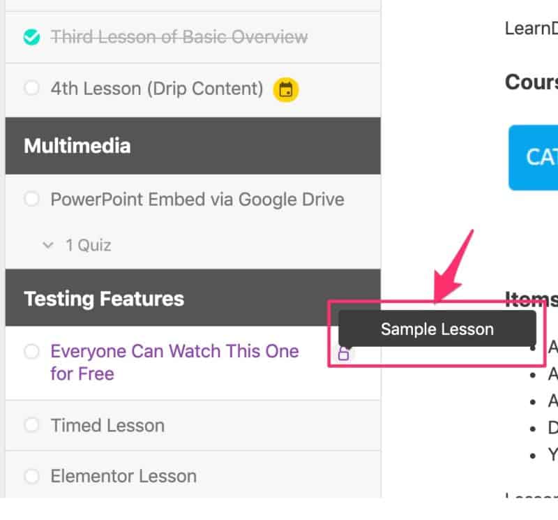
Tooltips are the small notes that appear when you hover over certain LearnDash elements and icons.
Design options
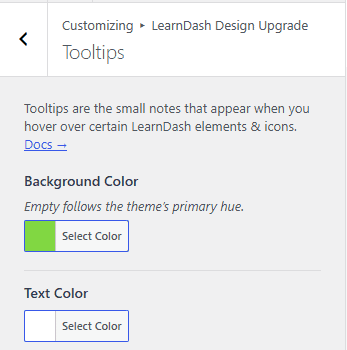
Two settings control tooltip appearance. Tooltips also inherit the Global Border Radius set in General Design panel.
Background color
Background Color sets the tooltip background color. Leave it empty to follow the Primary Hue set in General Design.
Text color
Text Color sets the tooltip text color.
For example:
- “Sample Lesson” appears when you hover over the unlock icon next to a sample lesson.
- “Available on {date}” appears when you hover over the calendar icon next to dripped content that isn’t available yet.