Progress Bar
The progress bar is used in several places to show a user’s progress. It gives students an at-a-glance view of course, lesson, or group completion. These settings also style progress bars used by certain third-party plugins.

LearnDash progress bars
Design Upgrade Pro styles the progress bar in these LearnDash locations:
- Course progress bar at the top of course pages
- Course progress bar in the focus mode header
- Anywhere the “Course Progress Bar” widget is used
- Course progress bar in the LearnDash Course Grid (
[/ld_course_list]) - Group progress bar at the top of group pages
- Course progress bar in the “Group Courses” list on group pages
- Group progress bar in the LearnDash Course Grid (
[/ld_group_list]) - Course progress bar in the LearnDash Profile (
[/ld_profile])
NOTE
remove the / on the shortcode when you use it
Third-party plugin progress bars
Design Upgrade Pro also styles the progress bar in these third-party plugin locations:
- Course progress bar in the Uncanny Toolkit Enhanced Course Grid (
[uo_courses]) - Course progress bar in the Uncanny Toolkit Course Dashboard (
[uo_dashboard])
Style options
Progress bar style
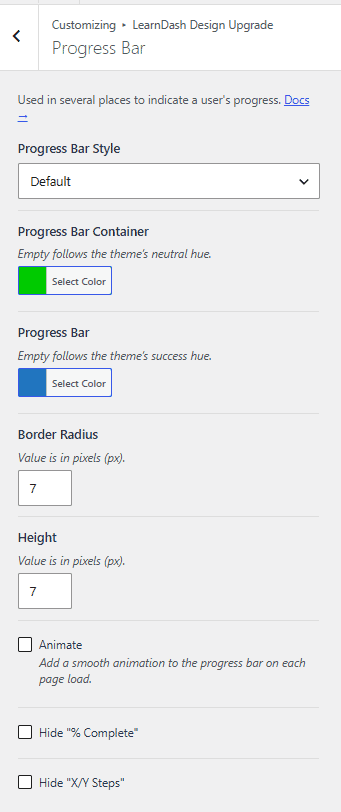
Progress Bar Style sets the progress bar’s fill style. The default is Default.
Progress bar container
Progress Bar Container sets the color of the container behind the bar. Leave it empty to follow the Neutral Hue set in General Design.
Progress bar
Progress Bar sets the bar’s fill color. Leave it empty to follow the Success Hue set in General Design.
Border radius
Border Radius sets the corner rounding of the progress bar. Enter the value in pixels (px).
Height
Height sets the height of the progress bar. Enter the value in pixels (px).
Animate
Animate adds a smooth animation to the progress bar on each page load.
Hide “% Complete”
Hide “% Complete” hides the “% Complete” text next to the progress bar.
Hide “X/Y Steps”
Hide “X/Y Steps” hides the “X/Y Steps” text next to the progress bar.