
General Design
The General Design panel sets the color palette and border styling LearnDash applies sitewide. Other panels build on these base settings instead of redefining their own colors and borders, so a single change here can cascade across your site. For example:
- Buttons inherit the primary hue for their background color.
- Alerts inherit the neutral, warning, and success hues, depending on the alert type.
- Alerts and Tooltips both inherit the Global Border Radius.
These settings also shape the design of several companion LearnDash plugins (see Integrations), keeping your site’s appearance consistent throughout.
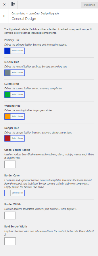
Color hues
Five hues make up LearnDash’s color system. Each hue drives a ladder of derived tones, lighter and darker shades generated automatically from the base color. Section-specific controls elsewhere in LearnDash can override individual components within that ladder.
Primary hue
The primary hue drives the primary ladder: buttons and interactive accents.
Neutral hue
The neutral hue drives the neutral ladder: surfaces, borders, and secondary text.
Success hue
The success hue drives the success ladder: correct answers and completion states.
Warning hue
The warning hue drives the warning ladder: in-progress states.
Danger hue
The danger hue drives the danger ladder: incorrect answers and destructive actions.
Global border radius
Global border radius sets the corner rounding for LearnDash elements, including:
- containers
- alerts
- tooltips
- menus
Enter the value in pixels (px).
Borders
Three settings control border appearance across LearnDash templates.
Border color
Border color sets the container and separator borders across all templates. It overrides tones derived from the neutral hue, though individual border controls elsewhere still take precedence over their own components. Leave it empty to follow the theme’s neutral hue.
Border width
Border width sets the hairline borders for separators, dividers, and field outlines. Enter the value in pixels; the default is 1 px.
Bold border width
Bold border width sets the emphasis borders for alert outlines, list-item outlines, and the content footer rule. Enter the value in pixels; the default is 2 px.